Role
UX Designer
Time
5 Weeks
Tools
Figma, Google Suite
Team
5 Designers
4 Developers


Non-Profits Get an UP-Grade. Students Gain Experience.
UP-Grade is UCSD Design Co’s 10-week summer program. DCo groups up students who apply for a variety of roles with one of many participating San Diego organizations, to elevate their branding and boost their exposure within the community, whether it be by redesigning a website or crafting an elevated social media presence.
Our Product Strategy Needed To Reflect What Makes UP-Grade Unique.
With UP-Grade 2024’s design language, we wanted to embody the collaboration, teamwork and diversity the program cultivates. The vast number of different roles, responsibilities, and stakeholders are what makes UP-Grade unique! With branding and product strategy, we wanted to highlight this diversity of interest and information.


Problem Space
How Might We Make UP-Grade an Eye-catching Product That Gets Students Engaged?
To understand what 2024’s UP-Grade outreach needed, we looked back on previous events and insights to outline potential opportunities. As my second project of this scale at DCo, this not only meant observation and analysis of previous efforts, but also a reflection on what could be done differently after my contributions to DCo's Design Frontiers 2024.
We Wanted to Create a Lasting first impression.
The first step to keeping attention is solidly getting ahold of that attention. Naturally, UP-Grade is a detailed program with a number of considerations any applicant or onlooker must be aware of. We knew we wanted to make the product engaging enough to completely fill in users with all needed details.
Maintaining Responsiveness Across all Devices is Important.
An essential challenge with creating fun interaction methods, visuals, and methods of hierarchy is ensuring that a consistent feeling and level of quality exists regardless of screen size. With UP-Grade 2024, we made it a key challenge to ensure that everything would be visible and accessible throughout.
Users should be able to quickly find any information they need.
Given that a lot of information exists in a product at the scale and depth of UP-Grade, it’s important to have a nimble interface and an information architecture with effective shortcuts, such that users can get to what they want fast.


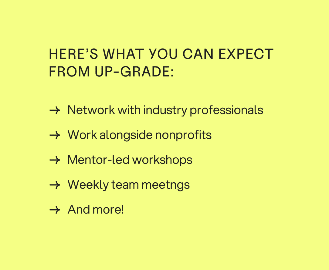
Overall, UP-Grade Has a LOT of Details to Display and Organize.
UP-Grade has a lot of content, all meant to inform and attract potential applicants. It was central that this content would receive an appropriate amount of separation such that each section feels unique and isn’t cramped.
Solution Space
A Grocery Trip Where Students Discover Key Program Details and Interface With Engaging Interactions.
Given the challenges and goals presented, we sought out to address them with a cohesive experience. Through brainstorming all the way to prototyping, many options presented themselves, many of which were considered or even implemented in some capacity. By the final design and production stage, we had a few key design solutions that brought the project together.
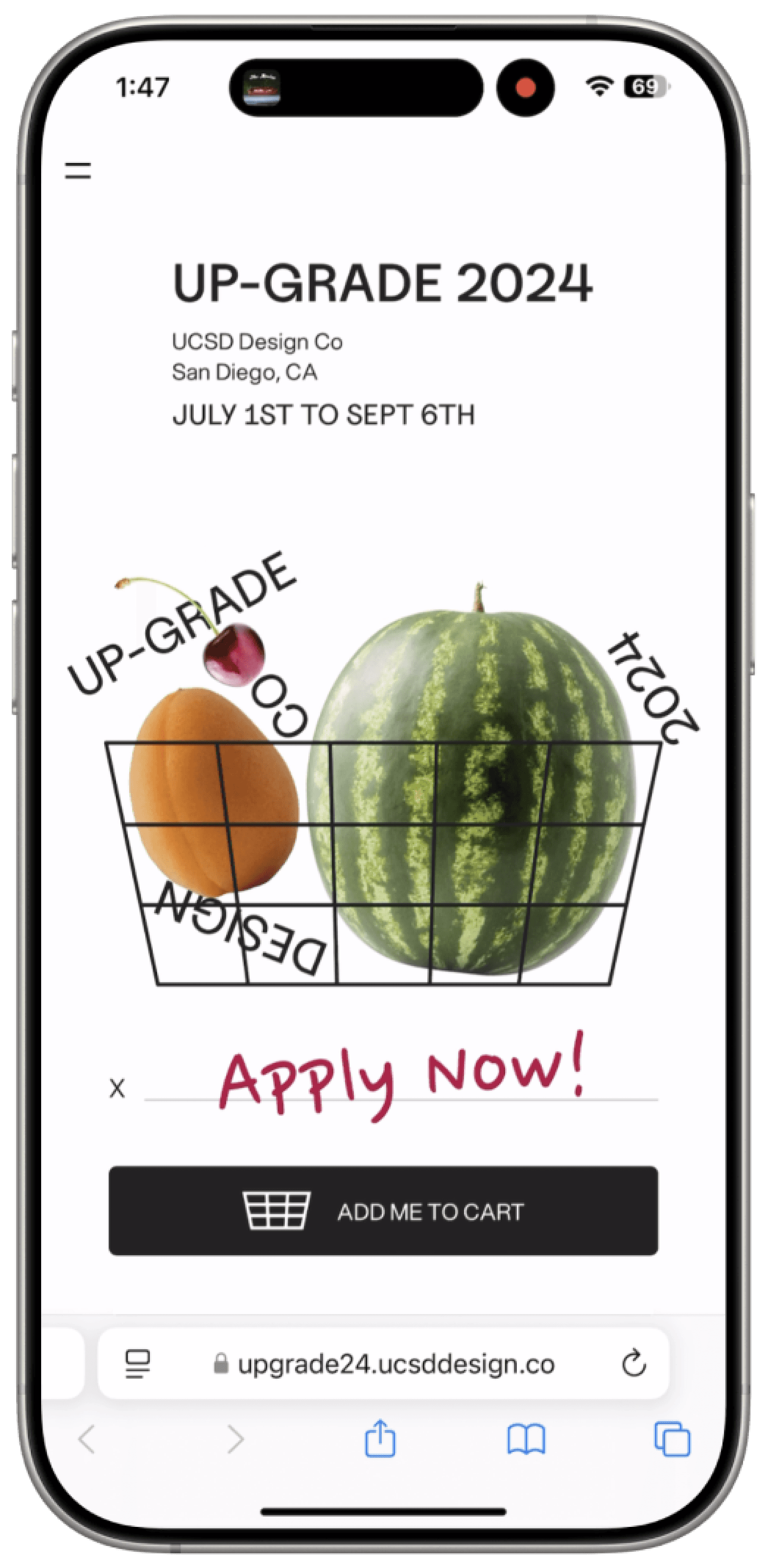
Tumbling Fruits Set the Stage For User Retention.


In order to increase user retention, we wanted to provide an impactful hero section that introduces users to the playful branding of UP-Grade 2024. For many, the summertime represents freshness, positivity, and new opportunities - this hero echoes this sentiment with fun animations, physics, and interactivity.
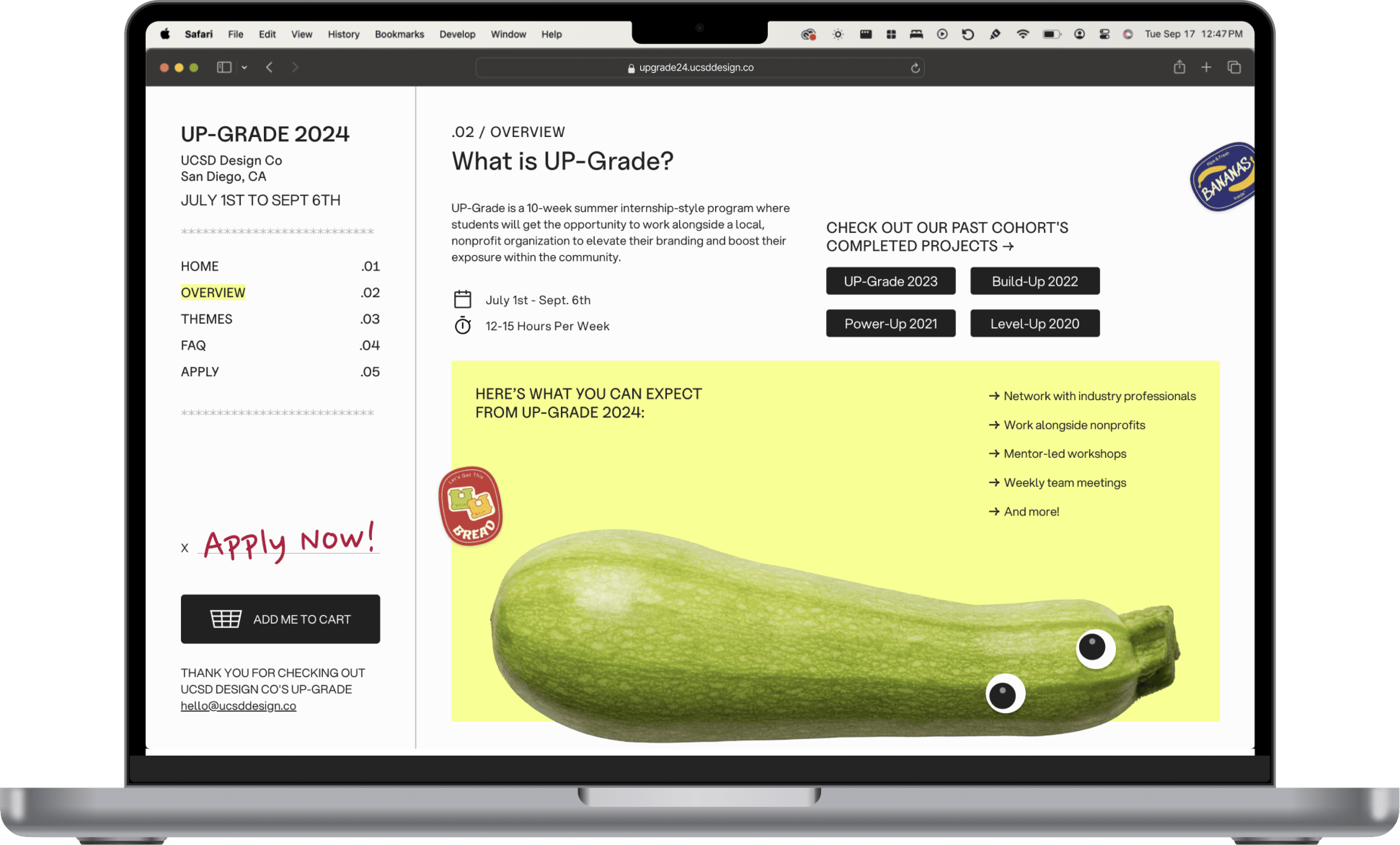
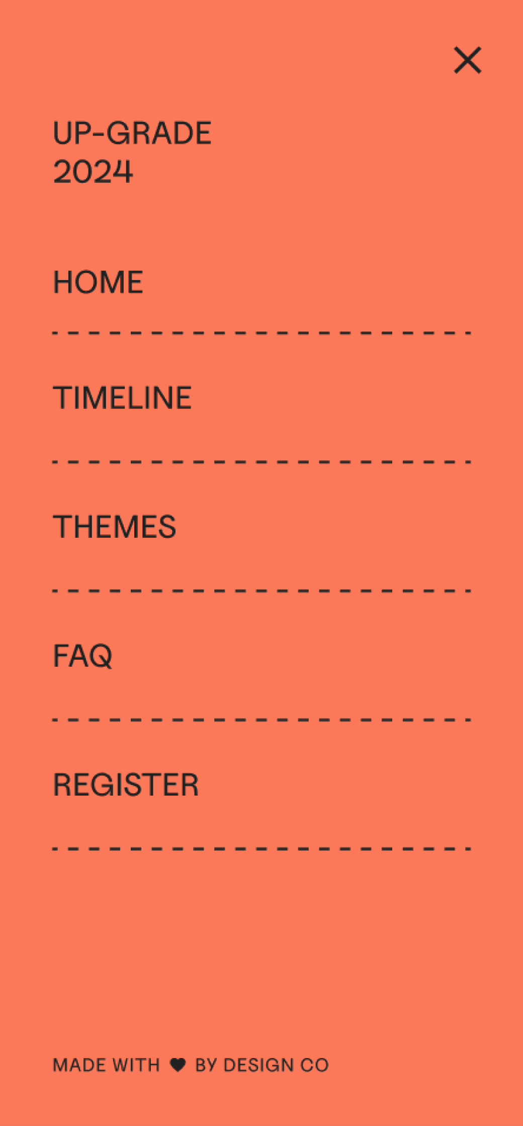
A Receipt That Gets You Where You Need to Go.
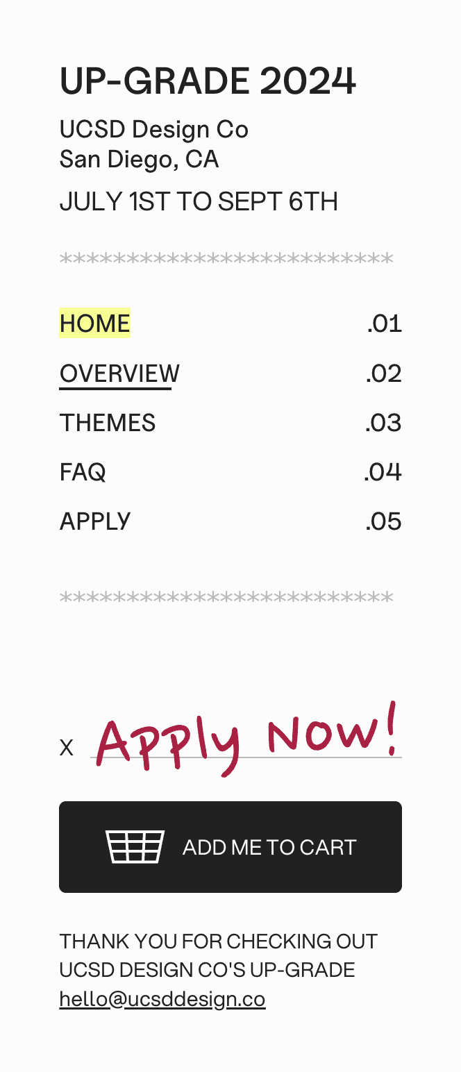
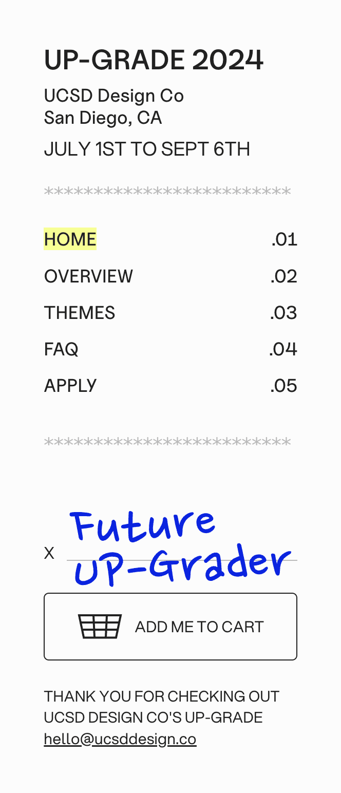

In order to ensure a nimble interaction model for UP-Grade, we designed a sidebar that contains all key details. Whether consistently on the left or at a mere button press away on mobile, this menu allows the user to navigate swiftly. Redundant information like the logo, relevant dates, and the location exist at the top, sections get highlighted in the middle, and a CTA for applying is placed at the bottom. All throughout, animations and tasteful colors bring the product to life, feeling like a real-life receipt!
Refreshing and Practical Visual Design.


It became clear that our ambitions for making strange and fun visuals were integral, but they needed to be restrained in order to not cause cognitive overload for the user. The result is a design system that balances this unexpected realism and whimsy with contemporary flat design, beautiful text hierarchy, and intentional signification.
Iterative Process


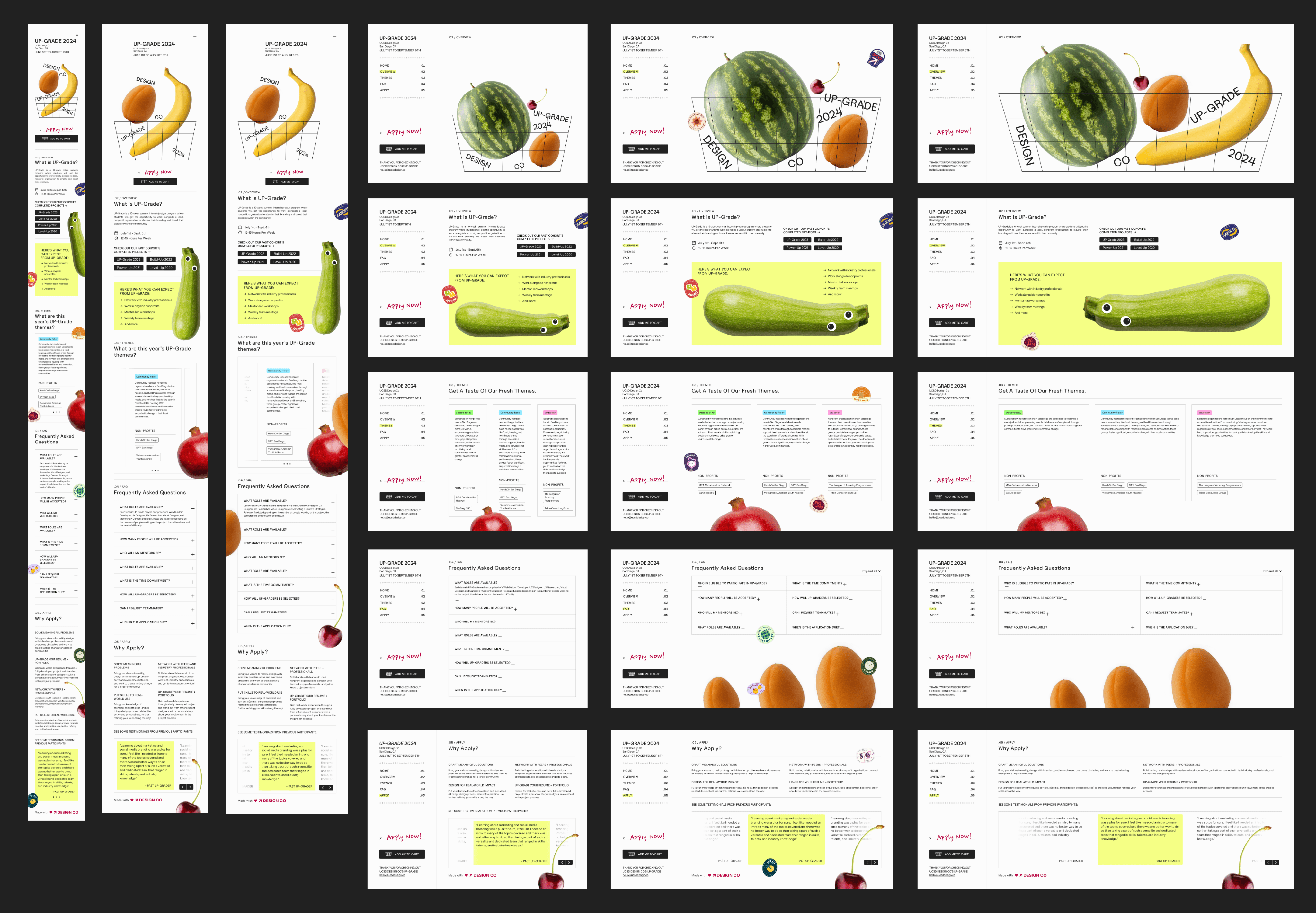
From each section, to the receipt menu, to creating detailed components and fresh assets, everything required energetic brainstorming and consistent progression of fidelity to develop and secure the complete visual design and experience. In the final stages of the product, we worked diligently to create breakpoints, design for edge cases, and annotate how our developers could ensure that final implementations suit our vision.
Retrospective Space
I’m adding Whimsical Design to My Cart.
To this day, the whimsical fruit theme, stickers, and tasteful interactions always get a lot of fun impressions from students, colleagues, and others still. Using a receipt visual as a sidebar and including all kinds of other recognizable symbols and visuals reminded me of how much I love to take inspiration from reality in my work. Pulling details from the real world is incredibly important to me, and I believe it is an integral part of forming design that truly feels human. I’ll definitely be doing more fun styles like this in the future!
Using CSS Scroll Snap Proved to be a Major Constraint.
Given the large amount of content, using scroll snap restricted each section to have content fit in the viewport. While this allows for a smooth and interesting single-page experience, we had to invest a lot of design thinking which took away from other areas. In fact, we already had to compromise on using this feature for mobile as the screen size made limiting content to the viewport in this way an even bigger challenge. Moving forward, I hope to use scroll snap in scenarios where the content is more visual and less information dense!
We Need More Time to Fuss Over the Details.
In future projects, I absolutely want to dedicate much more time for visual quality assurance. With this product, lead developer Aaron Chan and I spent 48 hours, all hands on deck, adjusting small inconsistencies before launch. It goes without saying this was not ideal and mentally taxing. I’m looking to streamline the design and development process for future DCo initiatives - I aim to reserve a full week for VQA going forward. With this in mind, I also wish to expedite and improve the process of designing high-fidelity breakpoints and edge cases, as it was helpful for our devs and should be bolstered.
Harnessing The Fruits of Our Labor.
Going forward, this product will serve two roles. One is as a learning experience and reference point for future projects. In developing UP-Grade 2024, I was really pleased with our creative organization methods and brainstorming, and I aim to make our processes more efficient with more usage of components, variables, and Figma dev mode tools. With this extra speed, we can allow our creativity to flourish and focus more heavily on usability and stability. The second role this product will fill is in displaying the fruits of all UP-Graders’ labor during Summer 2024. My team intends to update the site slightly given that the 2024 program has since ended, and add in case studies and closing thoughts!

