Role
UX Researcher
UX Designer
Time
10 Weeks
Tools
Figma, Google Suite
Team
6 Students


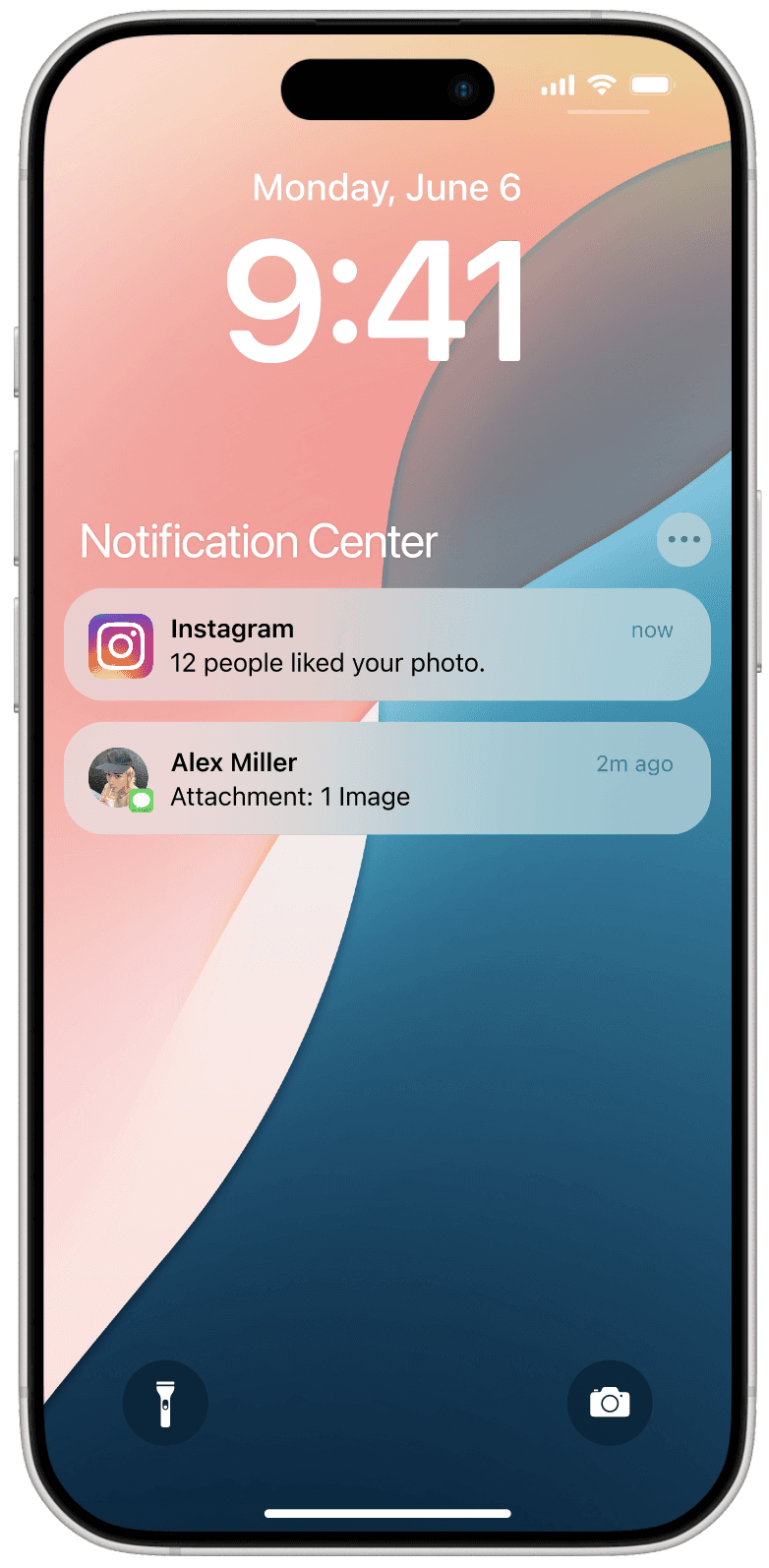

The Notification Center is Used Constantly By Millions of iOS Users.
The iOS notification center is where all notifications lie on an iPhone or iPad. With this system, users can keep up with messages, reminders, and updates of any kind. Since iOS 12, it has been improved and made more feature rich - such as organizing notifications into stacks by default. Are these changes too far or not enough to make users’ lives easier?
We Set Out to Audit the Center's Design.
A group of student designers and I worked together to deduce a variety of potential challenges with the existing iOS notification center’s user experience. Leveraging 17 user interviews and task analyses, we followed the double diamond design process to work through issues, opportunities, solutions, and redesigned center prototypes.
The Final Prototype
🔎
Accessible options
🧩
Familiar, internally consistent interaction patterns
🙂
Forgiving design with non-destructive actions

Problem Space
How might we improve the Notification Center’s Discoverability, User control, and Dependability?
My team conducted interviews and task analysis with 17 interviewees, and uncovered various patterns and usability issues, including user errors like capture slips and memory-based mistakes. Overall, our analysis allowed us to shine a light on and identify the issues noted above.
13 out of 17 Users Faced Discoverability Issues Due to Unexpected Design Patterns.
Certain features are not visible or accessible to users, and the features that do exist are often invisible, lacking signifiers and affordances that are inconsistent with typical iOS standards.
9 in 17 Interviewees Reported Clearing Notifications Often - Yet They Only Have Limited Manual Control Over the Center.
The notification center has insufficient affordances for how the notification center itself behaves. Many options exist solely in settings, for which there are few shortcuts. If a user wants a clean center, they should have more tools at their disposal.
12 Users Reported Having Mistapped Notifications - These Actions Cannot be Undone.
It’s undeniable that the iOS notification center has limited history functionality and is overly delicate. 5/17 users expressed concern about how easy notifications are to accidentally swipe away. User actions are destructive and permanent.


But… People LIKE the Notification Center, and Use it a LOT.
Despite any particularities about our interviewees’ comments and task performances, it’s worth noting that 16 out of 17 users were very satisfied with the iOS notification center. While this was not a great indicator that the product is perfect, it was important to keep in mind when exploring our solution space so as to not screw up what makes the current system great.
Solution Space
A New Notification Center that’s more familiar, empowering, and forgiving.
As a team, we reviewed many observed problems, some of which aren’t mentioned in this case study. Through this, we democratically and holistically chose the solutions we thought were most necessary. To help facilitate this process, we used dot voting to narrow down the problems worth solving and the solutions worth pursuing. While designing, we made sure that visuals, animations, and more matched up to iOS standards.
Giving Users Control Over Notification Pileup.
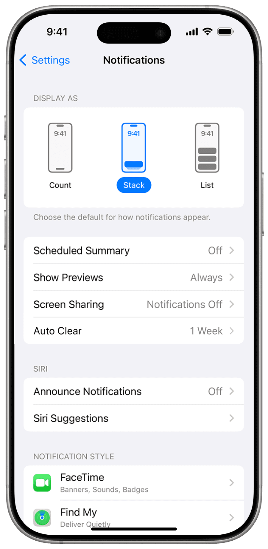
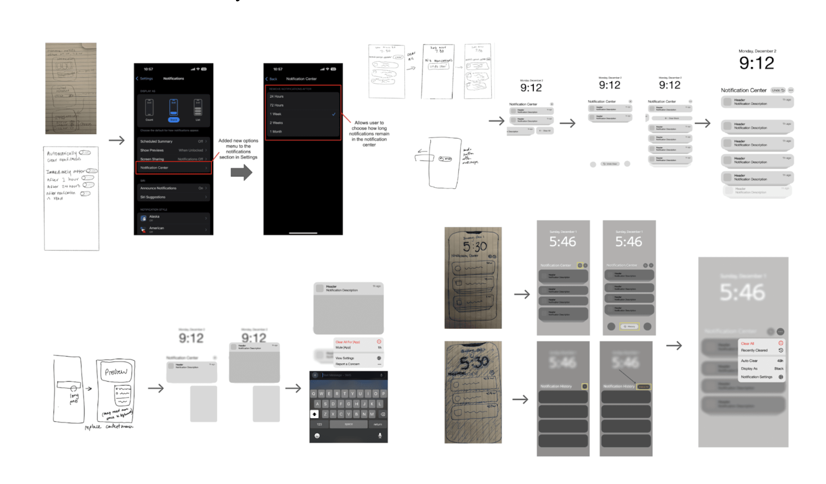
To address notification pile-up, we introduced an auto-clear setting, allowing users to choose how long notifications remain, from 24 hours to a month. This solution gives users more control over their notification center while balancing preferences for cleanliness and comprehensiveness. For convenience, the setting is accessible through both the phone’s settings app and the notification center.
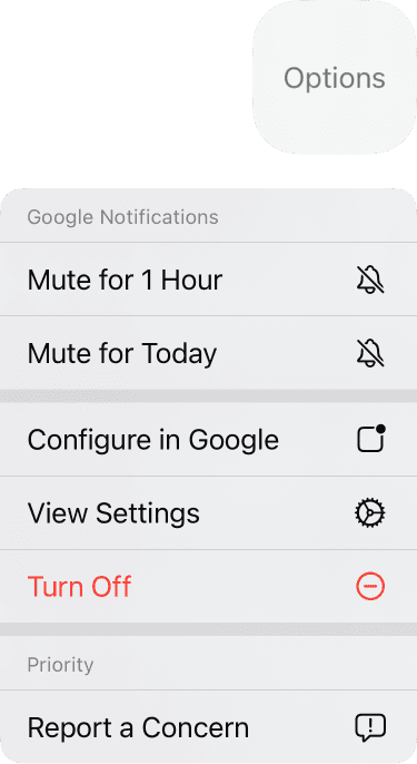
Contextual Actions Combined Into a Single, Familiar Menu.

We redesigned the long-press interaction in the notification center to include a compact context menu with options like clearing notifications, muting apps, and more. Interviews revealed users struggled to find the “Options” menu in the left-swipe feature. By combining that menu into the existing long-press feature, we enhanced discoverability via ensured consistency with other iOS context menus.
Improved History that Accounts For Slips and Uncertainty.

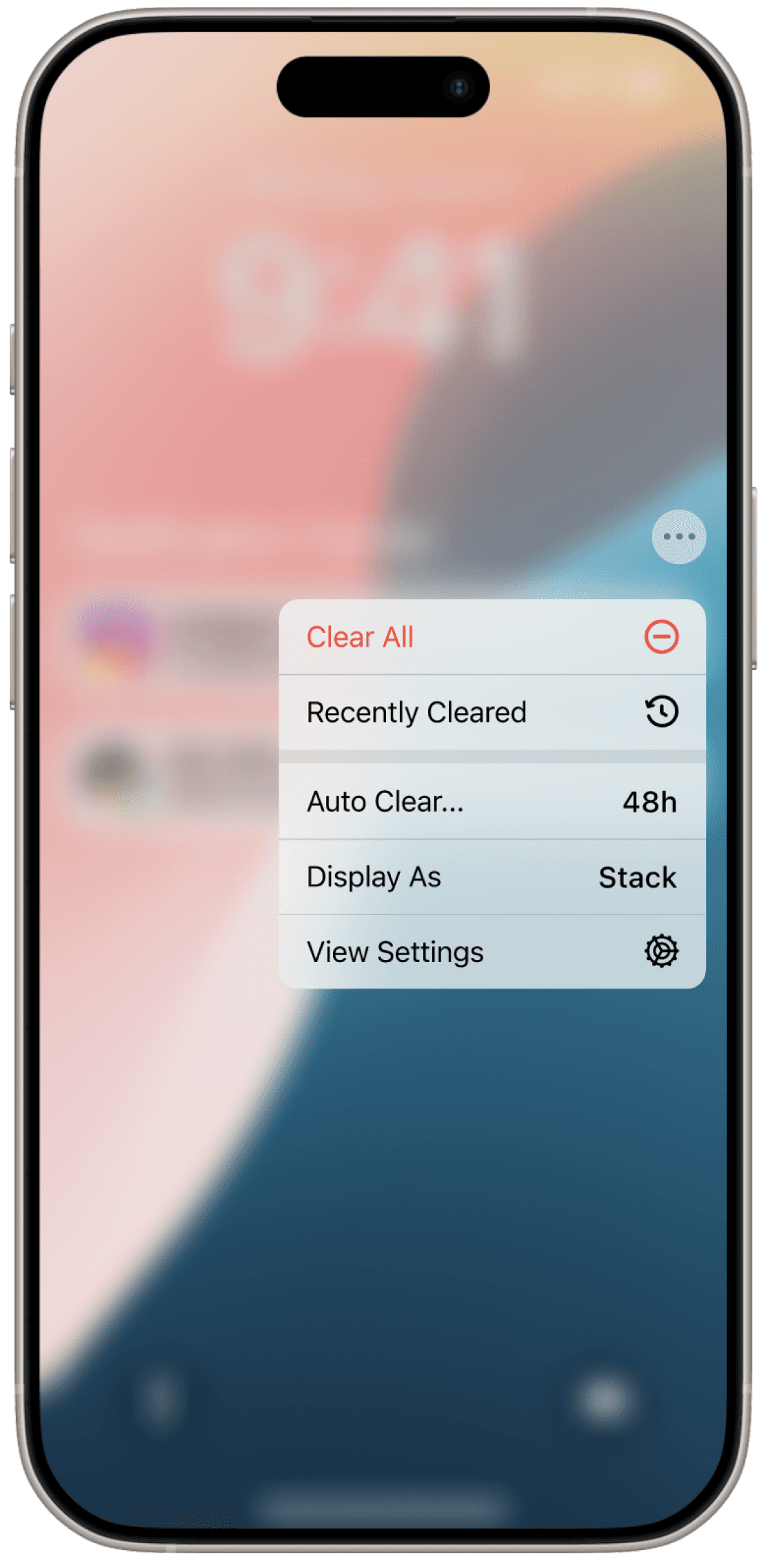
To protect users from accidental deletions, we introduced two solutions. One of these ideas is the "Recently Cleared" view. Similar to the "Recently Deleted" folder in Photos, it is a safety net that shows a few recently deleted notifications. An options button replaces the X button, consolidating actions like "Clear All," "Recently Cleared," and "Auto Clear" into a single, accessible menu.

The second pattern is the Undo Clear button. This button contextually appears when a notification is cleared, allowing users to reverse a recent deletion without altering the swipe-to-clear process, hence preserving their mental model.
Iterative Process: Rapid Prototyping

During the solution-building process, we defined design directions via brainstorming with a problem-solution matrix and sketching wireframes. Using Figma, we engaged in rapid prototyping of low-fidelity versions of these concepts. The project concluded with the high-fidelity interactive prototype and mockups seen in this article.
Retrospective Space
The Notification Center is Simple yet Complex, and Shows the Importance of Evidence-based Design.
This redesign introduces new features, and it was a challenge to consider which ones would leave the most impact. However, we feel like the proposed changes amplify what makes the current system so valuable. By giving more tools and insurances to the user, we hope this design enhances overall functionality in small but meaningful ways.
Adding and Changing Things Threatens Aesthetics.
The current notification center is simple and beautiful with its linear cascading design. The primary concern here is impacting this plainness, which is good enough for many people despite any faults that may exist. I believe that we struck a balance with the solutions we pursued - balancing innovation with usability was key.
The Undo Button Raised a Lot More Questions Than Answers.
While developing iterations of the undo button, a number of concepts were discussed, including a button that dynamically appears where a notification was cleared. However, this impeded on the bubbling up of notifications that allows the user to repeatedly clear them without strong focus. While this may not be an important pattern to protect, we designated the undo button to be near the X due to convenience and lack of usability testing.
User Testing Would Improve and Validate Our Solutions.
To really validate this project, user testing would be crucial. Important details could be assed, such as the effectiveness of the combined long-press context menu, or which variation of undo button is best recieved. Through this, we could recognize the validity of our solutions, or identify any areas for improvement. Furthermore, more refinement of high-fidelity prototypes would help solidify the design for final implementation.

