Role
UX Designer
Time
10 Weeks
Tools
Figma, Google Suite
Team
8 Students
1 Mentor


What is the San Diego Military Family Collaborative?
SDMFC, our stakeholder, supports military families by connecting them to resources and local organizations, many of which are within the collaborative as members. Particularly, SDMFC has monthly convenings and Military Transition Workshops that allow for military families to get involved directly. The collaborative’s website serves as a key hub for their offerings and much more, but it was quite dated! What’s more, our stakeholders at SDMFC wanted a simple Content Management System to quickly edit site content, as well as analytics to better assess performance. That’s where I and the rest of my team came in: to tackle these problems and much more.

Upgrading a Website With 10 Weeks on the Clock.
This summer, I completed a project aimed at redesigning the San Diego Military Family Collaborative’s website. Alongside other UCSD students, an alumni mentor, and our stakeholders at SDMFC, we crafted a new site where San Diego military families, organizations, and curious visitors could easily learn about the collaborative and access key resources and events.
The Final Design
🕺
Modern, content-first visual design
🔀
Improved site structure and strong calls to action
📈
3x improvement in information-finding speed


Problem Space
How Might We Improve the Accessibility, Visibility, And Versatility of Information Distributed by SDMFC?
First Off - What does it mean to be a SDMFC Member?
Early on, we made incorrect analyses about user groups. Once I recognized this situation, I immediately took the initiative to document and categorize these discrepancies, and pinned down four key user groups:
New Visitors – Those wanting to learn about SDMFC.
Military Families – Seeking resources, events, and organizational support.
Members – Interested in participating and contributing to the community.
Council – Focused on management and oversight.
New visitors and military families make up the vast majority of the user base, but we recognized that improving their experience depended heavily on the tools members and the SDMFC council have to deliver dynamic information.
Heuristic Evaluations Exposed Major Design Inconsistencies.
Designs are best when consistent, and they should mirror the real world. The SDMFC website had redundant double navigation bars, unclear text hierarchy, and inconsistent interactions. Overall, elements did not reliably signify importance and relationships. The consequence of this reality is simple - inconsistency leaves room for doubt, mistrust, and poor assumptions by users.
Interviews Showed That Information Overload was Impacting Discoverability and Navigation.
Interviewees noted that the website resulted in low understanding of the organization’s mission statement and objective. That’s very concerning - if users can’t quickly identify this information, they’ll be left wondering what they’re even doing on the website in the first place!
72% of Survey Responses Said the Website was Ineffective for Finding to Events and Resources.
Interviewees were largely unable to identify important information about the events SDMFC offers throughout the site. Connecting its users with events and resources is a major goal of the collaborative, and the current website was not sufficient.
Solution Space
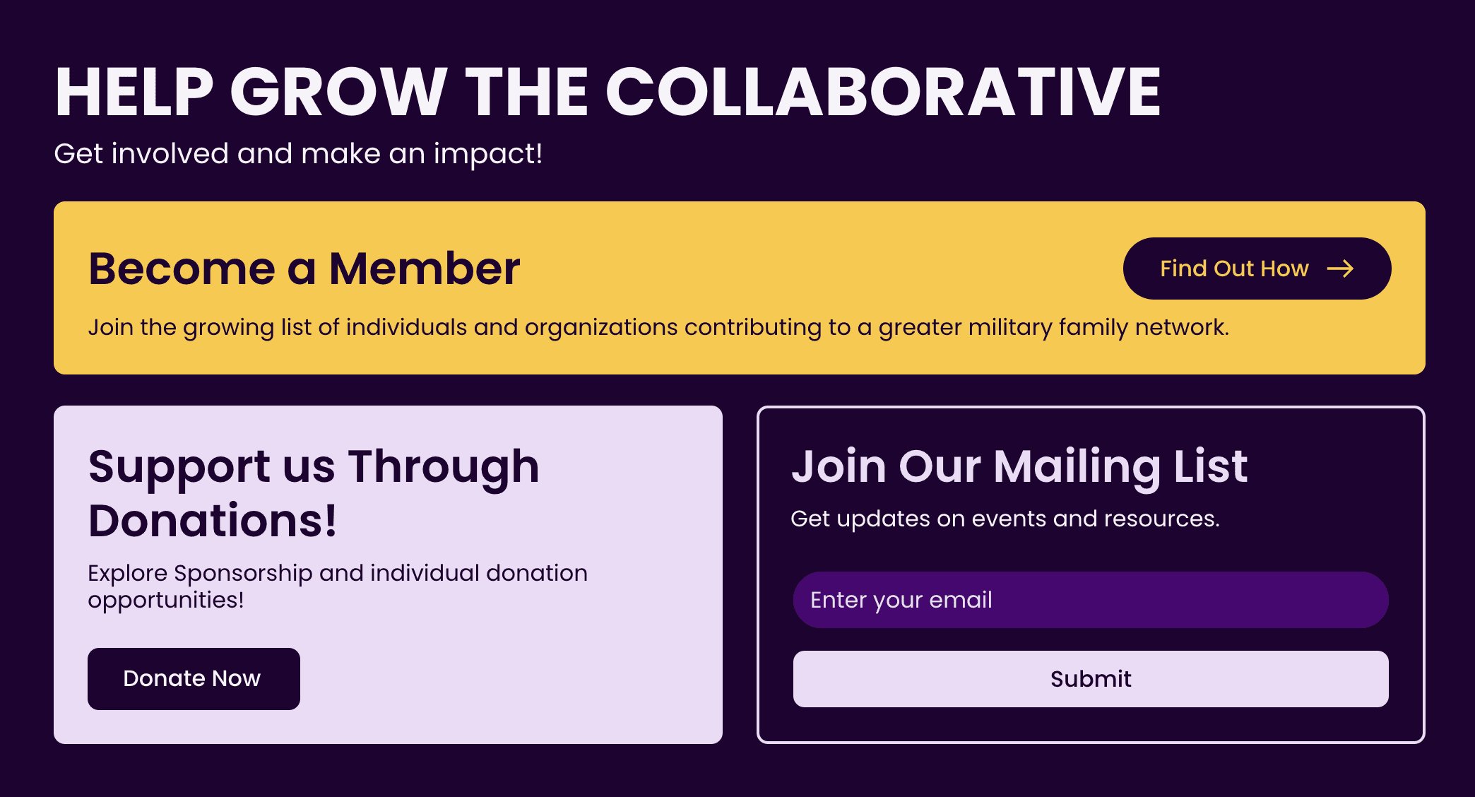
A New SDMFC Website That Prioritizes Content, Interaction, and Familiarity.
With clearer communication and more calls to action, we strove to better inform the average user about SDMFC and how they can get involved. Our content strategist took inventory of existing information from websites, newsletters, and more. Meanwhile, our we continued to interview users to identify effective copywriting, keywords, and content structures. Alongside this research, we designed new visuals and patterns that would align with SDMFC’s vision and mission, which we confirmed with weekly check-ins with stakeholders.
A Lightweight Design System for SDMFC.


We developed a design system that outlines a set of visual and interactive standards for the SMDFC website. Text styling, color use, iconography, spacing, and UI elements were documented to ensure the groundwork for consistency in all kinds of future updates after handoff to our stakeholders.
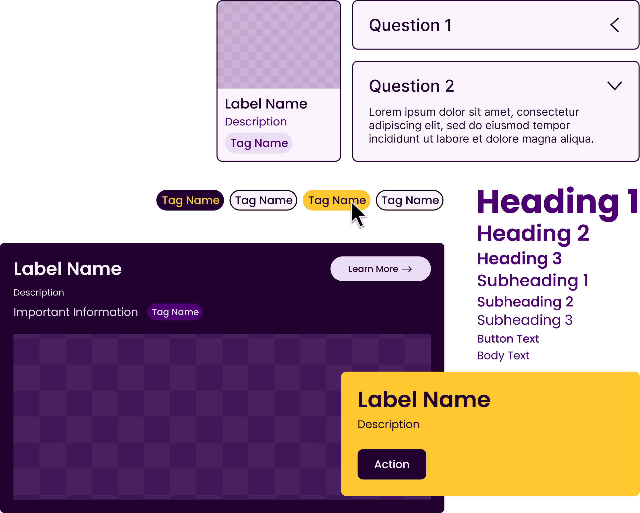
User testing revealed that small visual details can significantly improve comprehension. To leverage this, we developed consistent button styles tailored to user context and designed icons to clarify key information, such as whether events are in-person or virtual. For desktop users, hover states effectively highlighted interactive elements like buttons and cards, enhancing usability and reinforcing visual feedback.
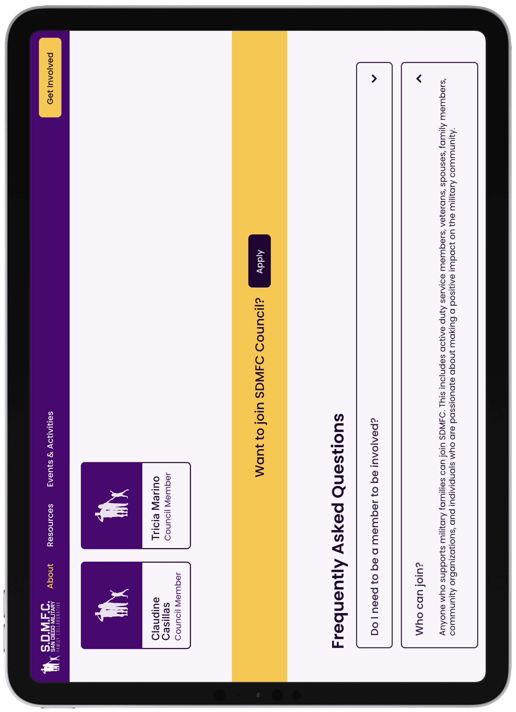
Straightforward Navigation and Content Organization.


To streamline discovery, we reduced and clarified navigation options, including a prominent yellow "Get Involved" button to signify higher commitment. Mobile-friendly adjustments ensured accessibility across devices. Content was organized using nesting, grids, and breadcrumbs, creating a clear hierarchy with large headings and matching URLs. These changes improved content understanding and provided users with an intuitive way to backtrack and explore.
Empowering User Discovery With Flexible, Reliable Tools.
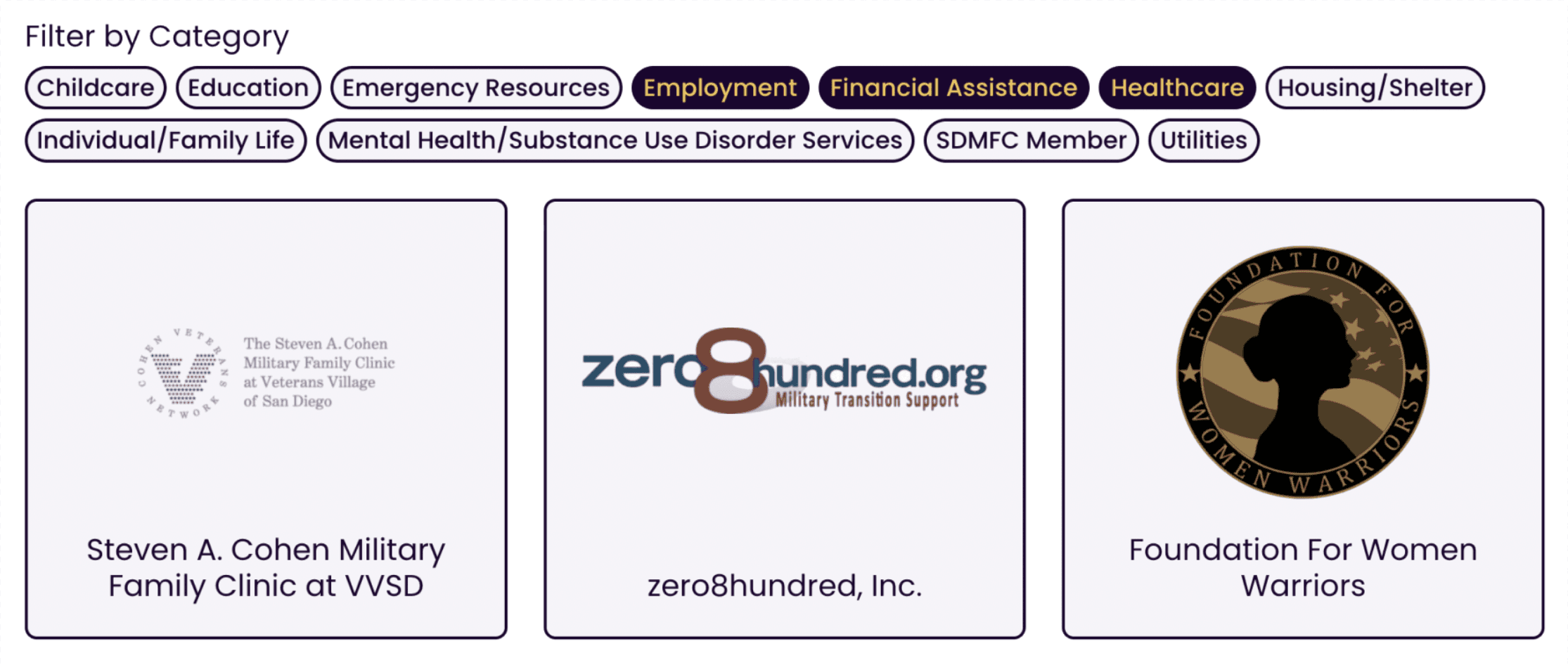
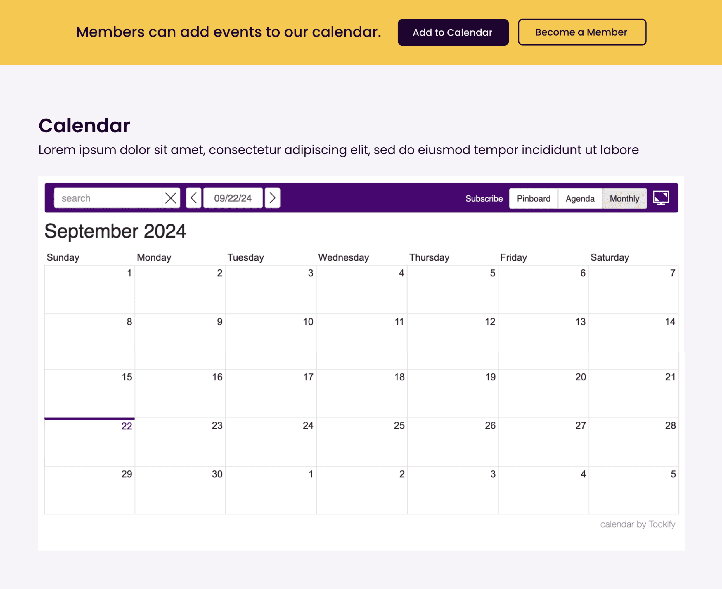
Dynamic information streams like resources and the calendar were important to get right. We streamlined resource filtering by replacing the old multi-page system with an on-page solution, enabling users to apply multiple filters with a single click for greater control and efficiency. For the calendar, we integrated "Tockify," simplifying event submissions and offering flexible viewing options like an agenda view. Even though we had to compromise on visual design, this third-party calendar was a good choice - it's a robust, accessible solution that fit within stakeholder needs and timeline constraints.
Iterative Process: From Words to Prototypes
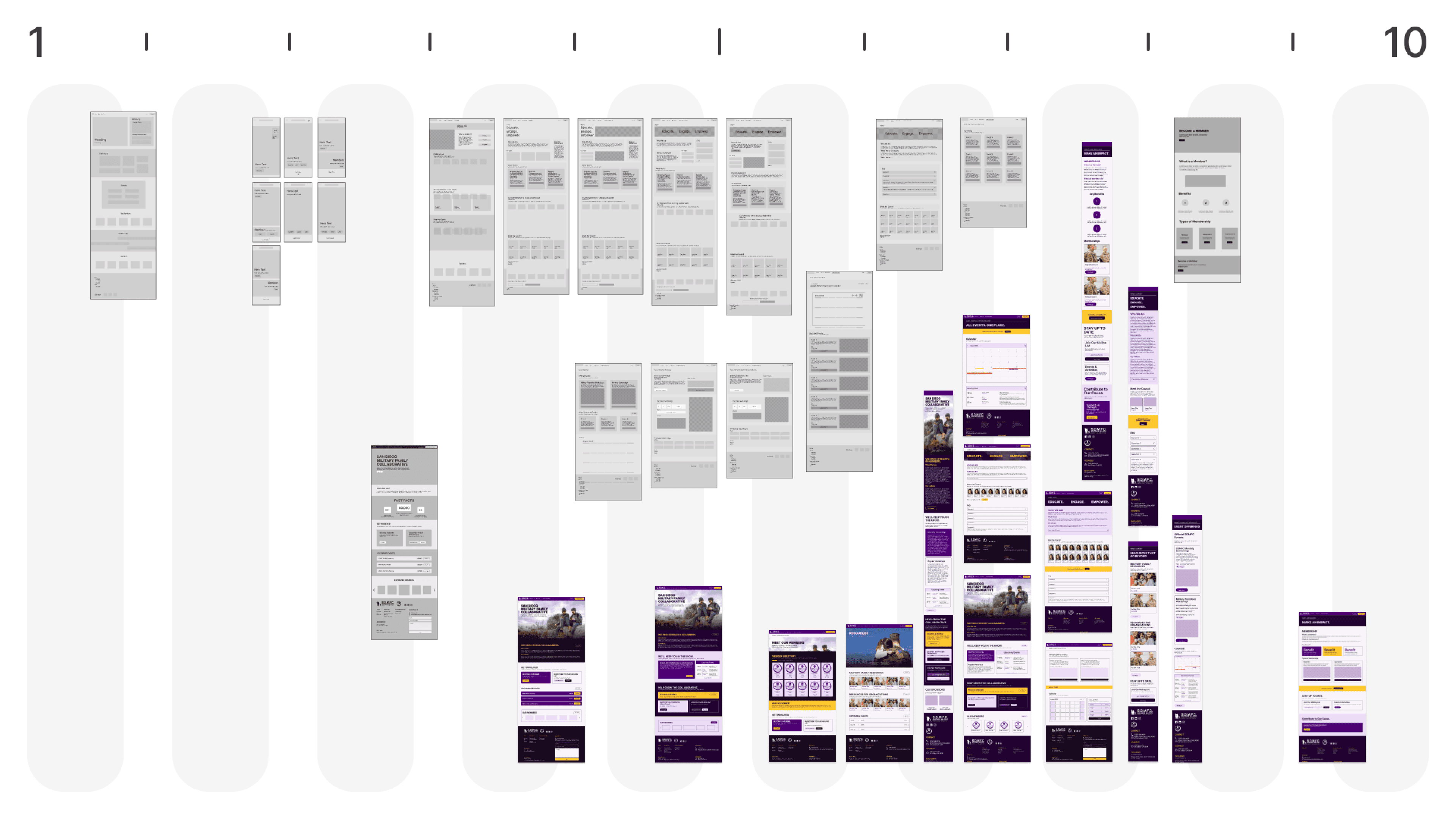
Design is an iterative journey, not a linear path. We began by assessing the existing website through stakeholder interviews, competitive analysis, and information architecture mapping. The next step was evaluating user sentiment and behavior, and leveraging UX standards to pinpoint areas for improvement. When it came to crafting solutions, we started by forming problem-solution matrices as per Tom Greever's Articulating Design Decisions. This approach allowed us to refine ideas early and transition effectively to wireframes. As fidelity increased, we could then focus more on visual design and prototyping for a variety of pages and ensure stakeholder satisfaction.
Retrospective Space
A lot of Time was Spent on Handoff. We Should Have Spent More.
Through this project, I grew as a designer, communicator, and collaborator. I made many tough decisions, and had to be incredibly efficient with my time. Additionally, our team demonstrated a lot of dedication - holding regular meetings, frequently messaging and tackling issues as they sprouted up, and holding one-on-one meetings to delve into specific topics. For that, I am extremely grateful.
Interviews are Much More Valuable Than Surveys.
One invaluable lesson I learned through this project is that quality is much better than quantity when it comes to user research. That might seem obvious, but with UX analysis I definitely feel like there is a pressure to show that what you did is relevant with big numbers. Interviews are significantly more useful as you can learn details about usage patterns and sentiment that you could never anticipate elsewhere. You can truly get a vision of users' mental models that form through using a product. I'll definitely keep this in mind for future projects.
Lots of Considerations, Compromises, and Unexpected Turns.
There were a number of times where roadblocks happened despite our best efforts. Some teammates were less active in completing tasks and less available with their time during this summer period. Additionally, our stakeholders had some wild cards through the project, including bringing in new members for consultation, adjusting product needs and priorities, and asking for features when time was running thin. Regardless, I personally did my absolute best to stay nimble during all of this so I could satisfy deliverables effectively.
Building a Sustainable and Future-Forward Product is Hard.
Even after my role as UX designer officially ended, I reached out to our primary contact to understand why the new WIX design hadn’t launched, despite our thorough documentation and readiness to support. I haven’t received a response, which is disheartening given all the effort put into the project. This experience taught me two key lessons. For one, the handoff process is critical - without it, even great design falls short. Secondly, some outcomes are just beyond your control - I was learning and completing a task for a specified period. Balancing tangible impact with personal growth as a designer is tricky, but I'll continue to get better at it!

